Showing posts with label a muse. Show all posts

Saturday, May 7, 2011

Paper Crafts Card Creations 9...


Did you get your copy yet?  I got mine in the mail from Paper Crafts the other day - I am excited that they chose 2 of my projects for this special issue.  It is full of amazing and inspiring cards for many occasions - I highly recommend you go out and buy it - you won't be disappointed!

Here is one of my cards that you'll find in this issue - the other one is on page 34.


Hope you have a super day! I am off to the nursery with my mom to buy her flowers for her pots for Mother's Day...

Paper:  A muse (winter sky), Stampin Up! (yoyo yellow, real red), XpressIt Blending Cardstock (Copic)
Ink:  palette hybrid noir black, Memento Tuxedo Black
Stamps:  A muse (cityscape, superhero, super day)
Accessories:  copic markers, pop dots (all night media), ribbon (supreme laces), Cricut (doodletype cartridge)

Sunday, April 10, 2011

Tuesday Trigger: A Burst of Blooms

I made a last minute card for this week's Tuesday Trigger in the Moxie Fab World.


I found some really cool trim at a local fabric warehouse a few weeks ago and it is perfect for this challenge.  The trim itself is off-white, but easily coloured with copics using some of the colour combos found in the flowers.  I stamped the sentiment on a card base with rounded corners, then I grounded a strip of the flower trim with an ivory scalloped base and adhered it to the card base.  I love how quick and easy this was to make!


Enjoy your day!  Thanks for stopping by...


Supplies:
Paper:  watermelon (A muse studio), vintage cream (PTI)
Stamps:  Eat Cake (PTI)
Ink:  fired brick distress (Ranger)
Accessories:  scallop edge punch (SU), corner chomper (WeR Memory Keepers), flower trim (NST), copics

Saturday, April 9, 2011

In my Beautiful Balloon...a Moxie Fab Challenge

Hot air balloons are beautiful...they are everywhere in the crafting world these days, and now that spring is here, I expect we will see some in the horizon from our back deck.  I am afraid of heights, and would likely never go up in one, but I love to watch them from the ground!!  I am also loving all the great creations that are being made for the latest Moxie Fab World Challenge "In my Beautiful Balloon".  Here is my entry:


Here is how the card came together...I hand-drew my balloon and cut it out of kraft cardstock.  I then cut out the stripes in different colours.  Once they were adhered to the balloon base, I stitched the seams for dimension.  All of the edges are sponged with distress ink which gives additional dimension.  I had to do all of that twice because my sewing machine ate my first balloon and completely wrecked it.  ACK!!!  The basket is made from half of the decorative label punch topped with a large scalloped border.  The sentiment fit perfectly on the basket - YAY!  The balloon is accented by kraft clouds and baker's twine ropes.

Hope you are having a wonderful weekend!


Supplies:

Paper:  kraft (SU), vintage cream (PTI), cherry, grass, orange & bermuda shimmer couture, eucalyptus (A muse studio)
Stamps:  everyday button bits, polka dot basics (PTI)
Ink:  versamark, burnt umber (palette hybrid), walnut stain distress (Ranger)
Accessories:  cappucino baker's twine (the Twinery), pop dots (ANM), corner chomper (WeRMemoryKeepers), decorative label punch (SU), cloud trio & jumbo scallop dies (MFT)

Tuesday, March 29, 2011

Blue Gingham & Sparkles

Today's card is a card just for fun...no challenge associated with it at all!  These cards are rare...

I have been drooling over the way JulieHRR uses bling and this card is definitely inspired by her talent with bling placement!


I rounded the corners on my card base and the main image for a softer look.  I punched the left edge of the main image then stamped the wild rose image and the sentiment.  I added some accents to the rose with glitter pens (red and hot pink).  I used tea dye inks to add some distressing and definition to all of the edges on the card and main image.  I adhered the main image with dimensionals.  Bling was added next as per Julie's card.  The scalloped edge at the bottom was an afterthought...the card was missing something and this edge helps to ground the main image as well as adds that magical third red element.

Hope your day has something "just for fun" in it too!


Supplies:
Stamps:  Wild Rose (A muse Studio), Have a beautiful day (A muse artstamps)
Ink:  noir black (Palette hybrid), warm red, maroon (Colorbox Qs), tea dye (PTI)
Paper:  blue gingham, currant (A muse Studio), Pure Luxury Ivory (GinaK)
Accessories:  scallop punch, notebook punch (SU), glitter pens (atyou spica), twinkle stickers (A muse studio), pop dots (ANM), corner chomper (WeRMemory Keepers)

Thursday, March 24, 2011

Magazine Monday... on Thursday!

I am trying out new things these days. 

Looking for new challenges, I found a colour inspiration challenge on Paper Crafts Connection.  Pretty, huh?


Using pink and purple? Yet another new thing for me!!  I had to scrounge pretty hard to find some purple in my stash! 


I seem to be using up random bits and pieces lately...the black shimmery label was in my pile of scraps.  I embossed the purple paper with dots and sanded it to reveal the white core.  I coloured the flower with copics, added some glitter in the middle and then a good amount of black peals (why hoard them??).  I stamped a tiny sentiment repeatedly along a strip of white and then added the punched border - the straight edge was too harsh and did not go with the flowery-purply look...  More complicated than my usual style, but hey...new things, right?!

Hope you try something new too...

Supplies:

Stamps: marvelous marigolds (A muse studio)
Ink:  noir black (Palette hybrid), tuxedo black (Memento)
Paper:  pink & purple (DCWV mat stack), onyx shimmer couture (A muse studio), pure luxury white (GinaK)
Accessories:  swiss dots embossing folder (Provocraft), kunzite glitter (Martha Stewart), black pearls (Kaisercraft), copics (BV17, V15, V12), dotted scallop punch (SU), black brads (SEI), styled labels die (Tim Holtz Alterations), pop dots (ANM)

Wednesday, March 23, 2011

Cityscapes are on the rise - Moxie Fab Challenge...

I love big cities...the hustle and bustle...taking the subway...walking around at night and not being the only ones on the street...the shopping (can't forget that!)...Plans are in the works for a second annual get-away-from-it-all trip to New York City!  I could totally live there if I had a few million to buy a place ;-)

So when I came across the Cityscapes Are On the Rise challenge on Moxie Fab World, I had to make a card!


Not much stamping on this one...only the sentiment.  I used a bunch of scraps - the herringbone background, the swiss-dotted clouds and the strip of green.  I used my cricut to cut out a blue cityscape silhouette.  I got some Tim Holtz sentiments in a trade this past year and cut one up a bit to fit on the card.  Love using bits and pieces that are laying around.  You have no idea how many times I have pulled out those clouds and tried them on a card...finally, they are glued down on one!!

Hope you are living the life you have imagined...

Supplies:

Paper:  lemon whip, sage, winter sky (white side), ocean & sugar shimmer couture (A muse studio), white (PTI)
Stamps:  Creative Muse (Tim Holtz/Stampers Anonymous)
Ink:  noir black (Palette hybrid)
Accesories:  herringbone & swiss dots embossing folders (Provocraft), cityscape die cut (Going Places Cricut cartridge), cloud trio die (Die-manics by MFT), pop dots (All Night Media)

Monday, February 28, 2011

My card is in Paper Crafts Stamp It! Techniques!!!

I finally have my computer back...it died on me at the worst time ever...glad to have it all fixed!  

I wanted to share my first project ever to be published!!  It's on page 45 of Paper Crafts Stamp It! Techniques (in the paper piecing section).  There are so many amazing cards in this special issue - if you don't have it already, you need it!!


Cardstock: (basic black) Stampin’ Up!, (pure luxury white 120lb) GinaK Designs
Patterned paper: (black gingham) A muse, (offbeat) BasicGrey
Stamps…rubber, foam, clear: (Lamp) A muse, (“Thank you for making us feel right at home” from Boards & Beams set) Papertrey Ink
Ink…dye, pigment, solvent, watermark, chalk: (noir black) Palette hybrid
Accent: (cranberry pretty pearls) A muse
Dies, embossing folders, brass templates: (Lots of Tags Label 1) Sizzix Sizzlits
Tool: (paper piercer) Making Memories, (Design Ruler) Tim Holtz
Other: (pop dots) All Night Media  

Instructions
1)     Stamp lamps on small piece of white cardstock (approximately 2” x 3”)
2)     Stamp lamps again on scraps of patterned paper
3)     Cut out lampshades, making sure to cut just inside the stamped line, and adhere to lamp images.
4)     Ground the lamps with two pierced lines
5)     Mat the main image on black cardstock
6)     Adhere main image to card base with pop dots
7)     Add strip of patterned paper to bottom of card base
8)     Die cut label and stamp sentiment
9)     Distress edge of label with fingernail for added dimension and interest
10) Adhere label with double layer of pop dots
11) Embellish lamps with tiny pearls

Friday, February 18, 2011

A muse Studio mystery!!

Hi!

If you read my blog, you know I love A muse...

There is something brewing right now with A muse - something fun and exciting - big changes!  You need to check out this Facebook page and/or these YouTube videos:


If you belong to Facebook make sure you like the A muse Studio page...you could win a box full of thirty nine (39!!!!) yummy pigment ink pads...

Run QUICK!!!!

Saturday, February 12, 2011

A Cameo Card...

I have not made a card for a challenge in ages!  The current challenge at Moxie Fab World is "The Appearance of Cameos"..truly a challenge for me as I have no cameo stamps.  After checking out Google Images for inspiration, I was happy to see that cameos are not just faces of women...they could be flowers or butterflies or scenes.  Here is what I came up with:


Supplies:

Stamps: gossamer wings (A muse), borders & corners oval (PTI)
Paper:  latte, red shimmer couture, watermelon (A muse)
Ink:  versamark
Accessories:  black embossing powder (SU), black superfine detail embossing powder (Ranger), black pearls (Kaisercraft), styled labels die (Tim Holtz), black ribbons (Supreme Laces), Dymo labeller, corner chomper

The butterfly and oval frame are heat embossed for a bit of dimension - I used detail embossing powder for the oval frame and regular embossing powder for the butterfly.  The black elements help the eye travel around the card.  I kind of like the pink label backed with the red panel - doesn't clash at all!! Hope you like it...make sure you check out the challenge and play along!

Wednesday, January 19, 2011

Teachers are amazing...

I am sending this into my "grade one-er"'s (as he calls himself) teacher because she is clearly amazing...

We had his 7th birthday party this past weekend at our house- 2 parents to 12 boys (ages 5-8) - it was an intense 2 hours.  Their energy was unbelievable - it's a wonder the only "injury" was one bloody nose!  And this was not even all the boys in his class - imagine a class full!!  I am still in a state of shock from the party - I don't think I'll ever forget it!!


Instructions:
1)      stamp 3 pencils, colour with copics and cut out
2)      cut 3 thin strips of cardstock in the same colour as the pencils
3)      adhere pencils & thin strips to white cardstock of main panel
4)      stamp sentiment
5)      mat main panel in black
6)      adhere orange patterned paper to bottom ¾ of card base
7)      adhere twill ribbon where orange paper and card base meet
8)      adhere main panel over top
9)      adhere punched star

Supplies:

Paper:  GinaK (Pure Luxury White), BasicGrey (lime rickey), A muse (cobalt blue, shimmery orange, chiffon green), Stampin’Up! (basic black), Copic (XpressIt blending cardstock)
Ink:  Palette hybrid (noir black), Memento (tuxedo black)
Stamps:  A muse (pencil, for a special teacher)
Accessories:  Star punch (Stampin’Up!), copics, green twill ribbon (unknown source), pop dots (all night media), Corner Chomper

Saturday, January 15, 2011

Time for fun...a party card...

I have a "reject" from a magazine call that I thought I'd share tonight...


This card was a lot of fun to make...colouring with my copics, masking the cactus and lots of glitter!  It's hard to see, but the sombrero is pretty glittered up and there is a red-glitter-dotted-border on the black mat.  This card is in honour of the busy month of January with 2 birthdays in the family and a trip to Florida coming up quickly :-)


Supplies:

Paper:  Pure Luxury White (GinaK), XpressIt Blending Cardstock (Copic), basic black (Stampin' Up!)
Ink:  Memento Tuxedo Black, Palette hybrid noir black
Stamps:  A muse (cactus, sombrero, time for fun)
Accessories:  MS glitter (carnelian), pop dots (All Night Media), Copic markers, Ranger liquid pearls (ruby red), Eclipse masking tape

Saturday, December 18, 2010

My Last Minute Christmas Card...

I seem to do everything at the last minute...I have very little time to plan ahead because I am always doing something at the last minute that needs to be done NOW, leaving no time for planning.  Sigh...

Nevertheless, I have been stealing bits and pieces of time here and there to plan bits and pieces of this year's Christmas cards in my head...this card is all of those fragments put together.  There is an interesting thread on Splitcoaststampers discussing whether stampers just "wing it" or plan out their cards ahead of time...neat to see how everyone creates!!  I like to and usually do create spontaneously but when I have taken the time to gather all the elements ahead of time and map out my card, less wasted cardstock and supplies is the result! 

This card also fits with the latest A muse Lounge Challenge "Sparkling Season"  - to make a card that sparkles...

So without further ado, here is my planned-out-ahead-of-time sparkling card:


Here is how it went together:
  • I traced the hill on a scrap piece of white cardstock and cut it out
  • I placed the white hill on the card base in order to properly position the sentiment and the snowman
  • Using my Stampamajig, I stamped the sentiment first and the snowman second (I pulled the white hill out of the way in order to stamp the snowman completely on the card base)
  • Next, I put the hill back on the base, lined up the snowman image on the acetate from the Stampamajig over the snowman on the card base, slid a post it under the hill (to avoid stamping over the card base) and restamped the (lower part of the) snowman on the hill.
  • Next, I ran the card base through the swiss dots folder on my cuttlebug and sanded the dots to make the white core appear on the cardstock - snow!!
  • Then, I adhered the hill to the base, lining up the snowman
  • Then, I stamped the snowman a third time on a scrap of white, coloured him with copics and cut him out (leaving off his arms and the snowballs)
  • I adhered the cut out snowman over the snowman on the hill.
  • I coloured the snowballs on the card base with white gel pen 
  • Lastly, I used crystal effects on the edge of the hill and on the snowballs and sprinkled on glitter (I used Diamond Dust which is soooo sparkly because it is actually tiny pieces of glass - sharp if you get a sliver!!)
Hope you enjoy the holidays...thanks for stopping by today!!

Supplies:

Paper:  A muse (winter sky), PTI (white)
Ink:  Palette hybrid noir
Stamps:  A muse (juggling snowman, enjoy the wonders)
Accessories:  Crystal effects (SU), Diamond Dust (twinklets), copics, pop dots, cuttlebug, swiss dots folder, sanding block

Friday, November 26, 2010

My A muse Teeny Tiny Calendar Book...

I love buying the A muse calendar every year...this year there are so many sizes available and there is always a good cause involved.  The proceeds this year are going towards Charley's Fund.
Charley

My calendar this year is an adorable teeny tiny mini book.  It measures 2 1/2" square.  Other years, I have used the 4" square calendar and made 6x6 scrapbook pages either put into page protectors and tied together with a ribbon or bound with my Bind-it-all.

But this one...it's so cute I could just about eat it ;-)


Here is how I made it:

1) Cut 12 pieces of patterned paper measuring 2 1/2” by 5”
2) Score and fold the first piece at the halfway mark lengthwise with the pattern facing inwards.  Repeat with the remaining 11 pieces
3) Open up the first piece
4) With patterned side of the first piece now facing you, adhere the reverse side of the bottom half of the first piece to the reverse side of the top half of a second piece of patterned paper (see picture below)


5) Fold the first piece back in half with the pattern facing in – you now should see the patterned side of the second piece opened up
6) Repeat steps 4 and 5 with the remaining pieces of patterned paper


7) To make a cover for your mini book, cut 2 pieces of paper 2 1/2” x 3”, scoring vertically along the long side at 1/2”
8) Adhere the 2 1/2” square portion of each piece to the front and back of the mini book (to the reverse sides of the first and last pieces of patterned paper)
9) Finally, adhere the 1/2” portions together at the top of your book to cover up the folds of patterned paper
10) Print out mini calendar and cut each month to be 1 3/4" square
11) Cut 12 2” square pieces of paper and mat each month
12) Adhere matted months to inside of each mini book page
13) Punch out year and adhere to front of mini book
14) Decorate and embellish as desired

I hope my instructions were somewhat clear!  Thanks for checking out my little project! 

Enjoy your day...

Supplies:

Paper:  A muse (gingham, eucalyptus), GinaK Pure Luxury white
Ink:  none!
Stamps:  none!
Accessories:  SU curly label punch, A muse mini calendar

Thursday, November 25, 2010

CASEing CriminalGrace...


Supplies:

Paper:  A muse (gingham, robin's egg, eucalyptus, shimmery white)
Stamps:  A muse (Holiday combo)
Ink:  Versamagic Turquoise Gem
Accessories:  MS snowflake punch & drippy goo punches, pop dots, SU silver glass glitter, a muse twinkle stickers


The Featured Stamper on SCS this week is CriminalGrace. Her card designs are always clever & inspiring, plus she loves A muse stamps! I made a card based on her Trio of Tulips...switched up the season and changed the colour scheme but kept the great layout.

I recently ordered some of the glass glitter from SU after using it at stamp camp...this stuff is heaven - glitter that actually only goes where the glue is and is really easy to clean up after! I can use it and not be a sparkling glittery mess afterwards!! I "cheated" and used the MS drippy goo punch instead of the more winter-appropriate icicle punch. Covered in glitter, I think they look close enough to icicles!!

Make sure you check out Sarah's wonderful gallery...and have a great day!


Posted by Picasa

Saturday, November 20, 2010

Pobody's Nerfect...


...and that includes me with my horrible handwriting!!  That is the challenge this month in the A muse Lounge - "Dashes, Dots & Doodles" -to include something handwritten on your card.  Sigh...

While he was working, my dad had a piece of art in his office above his desk that my mom made (with buttons glued onto cork - very 70s!!).  It featured several owls on a branch with one upside down and the saying "Pobody's Nerfect".  I just received a small shipment from A muse which included this owl stamp - I had to buy it because it brought back memories of visits to my dad's office...

This card is a re-creation of that kitschy piece of art featuring my own handwriting (which I think is a complete eyesore on this card)...I wish A muse had had a stamp for this, then I could have hand-drawn the "branch" for the owls instead...

Hope you enjoy this one and have a great weekend!!

Supplies:

Stamps:  A muse (skinny owl)
Ink:  Memento Rich Cocoa
Paper:  A muse (latte, shimmery brown)
Accessories:  copics, pop dots, SU curly label punch, SU markers
Posted by Picasa

Monday, November 15, 2010

What a Lineup...


I was in the mood of colouring so I stamped a lineup of A muse characters and went to town with my copics. I quite like the Xpress It blending cardstock from Copic. I matted the main image with yellow to make it stand out, grounded the lineup with some ribbon and mounted it on the blue base. I stamped the sentiment and punched it out in an arrow shape.

It could be fun to make different lineups...not only people - animals, food, vehicles (a traffic jam)....

Supplies:

Stamps:  A muse (scarecrow, policeman, robot kid, superhero, hello)
Ink:  memento tuxedo black
Paper:  A muse (cobalt blue), Copic (xpress it blending cardstock), SU (summer sun)
Accessories:  ribbon (May arts), SU arrow punch, pop dots, copics
Posted by Picasa

VSN - fun on Cloud Nine

This past weekend was the main virtual stamping night on Splitcoaststampers...this time the theme was "On Cloud Nine".  I was lucky enough to get to host the first challenge of the day on Saturday.  My challenge was called "Not a cloud in the sky"...to make a card with lots of white space.  There were lots of great cards made - feel free to check out the gallery for my challenge!  The great news is there is still time to play in any of the challenges...the deadline is Monday, November 15th at 10pm EST.

Here is the card I made:


This would be great for scraps in any colour combo you choose...I used a 1" square punch, fussy cut the sentiment and adhered it over the squres with pop dots.  To finish, I pierced a border around the card. 

Supplies:

Stamps: A muse
Paper: A muse, SU very vanilla
Ink: Memento rich cocoa
Accessories: paper piercer, pop dots, 1" square punch

I hope you can find the time to make a card for my challenge...I get to choose a winner when it's all said and done...it could be you!

Sunday, October 31, 2010

Sweater Weather - Madeira Hello


The current Tuesday Trigger "Sweater Weather"- a sweater from Anthropologie 
(one of my favourite stores...)


This card uses the colours, the buttons and the subtle pattern found in the sweater. The sweater is also quite symmetrical looking - 4 buttons, 2 pockets, lines on the collar...
 
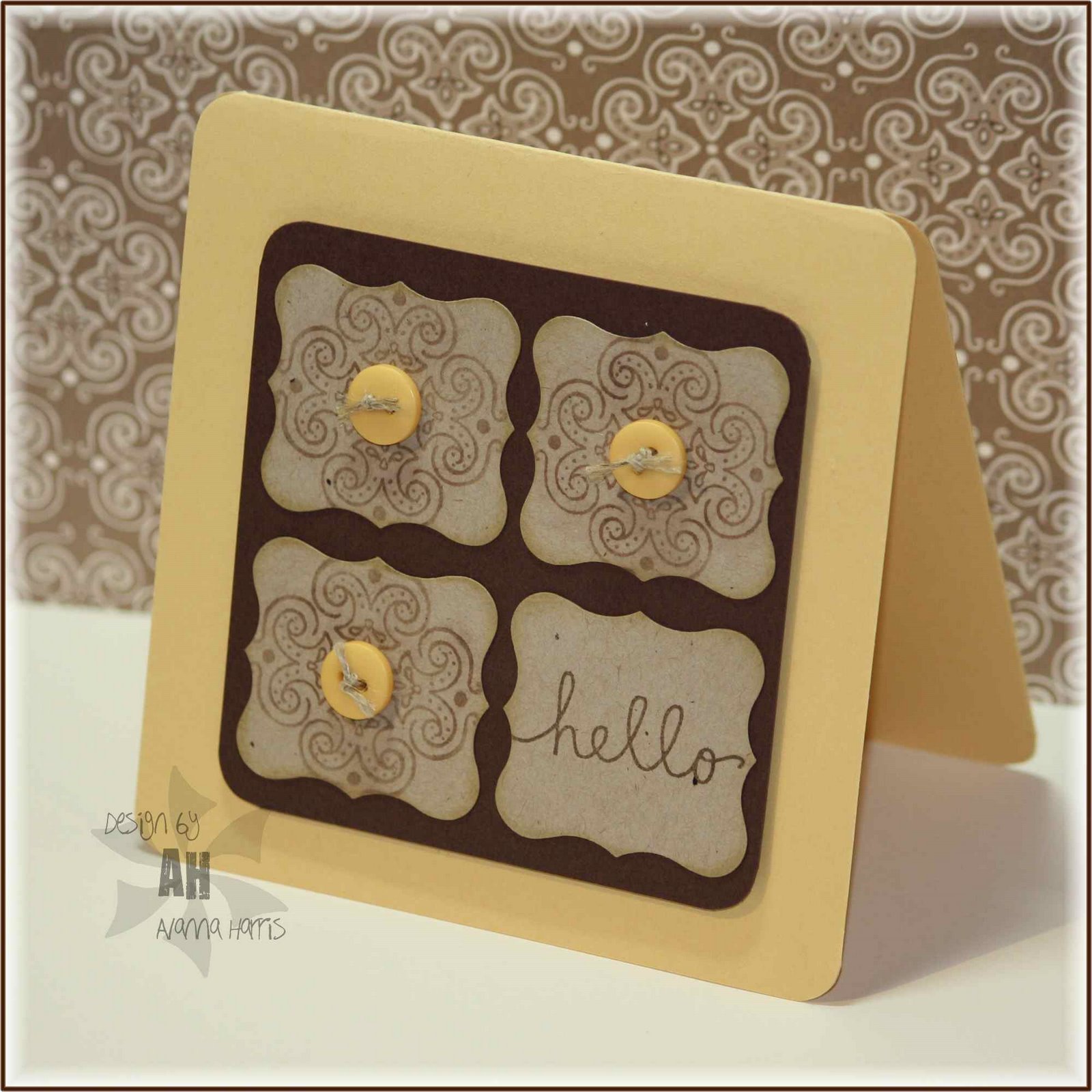
I stamped the madeira pattern in versamark, but it didn't stand out as much as I liked once I tried putting the buttons on, so I used some pastels in brown (popping pastels technique) to make the pattern a bit darker. I saved one of the curly labels for the sentiment.  I use this layout a lot - I love symmetry! Hope you like it too...


Stamps:  A muse (madeira, hello)
Ink:  palette hybrid burnt umber, versamark
Paper:  SU (kraft, summer sun, chocolate chip)
Accessories:  SU pastels, SEI buttons, SU linen thread, SU curly label punch, corner chomper

Posted by Picasa

A sympathy card...


This is the type of card that no one ever wants to make...this week's CAS challenge on SCS is to make one. I got a recent shipment of Copic's new XpressIt blending cardstock and cut into it for this card. It coloured well although I notice some tiny white/light spots (?fibres?) in the paper that did not take the grey ink. Hmmm...will have to play a bit more. It does add some interest and texture to the dove! I added some silver glitter on the dove using my silver spica pen. The image was matted in black, then mellow moss and popped up. I added the sentiment and 3 pearls for a simple design. Hope you like it!

Supplies:

Paper:  GinaK pure luxury white, SU basic black & mellow moss, Copic Xpress It blending cardstock
Ink:  Memento black
Stamps:  A muse (peace & cheer set, in my thoughts)
Accessories:  copics, pop dots, black pearls (kaiserkraft)
Posted by Picasa

Monday, October 25, 2010

Gingham Greetings


I stayed up late to stalk CAS90 on Splitcoast because next week's evenings are all so busy my head is spinning already! How fun that this week's challenge is to use gingham and checks on a card. I am a huge fan of A muse's gingham paper, in fact I have just ordered my second multipack - I have been using, not hoarding it!!

For the card, I stamped the bird image directly onto the gingham paper. This paper handled colouring with copics fairly well, even with reds. I think it's kind of neat how you can see the gingham pattern (and it doesn't really even look blue) a bit through the colours. I stamped the sentiment on blue gingham as well. Both images were matted in black, although the sentiment got a thicker mat.

One of the reasons I did this was to help the sentiment stand out as it's relatively small. The three pearls under the sentiment also help with this. The second reason is to draw the eye to the bottom right of the card. Once your eye is there, the circlular shape of the sentiment makes you look around the whole card again. (Actually, I pretty much winged the design and figured all of this out after the fact!!)

Hope you like it...go grab your gingham and checks and make a card for the challenge!

Supplies:

Ink:  palette hybrid noir
Paper:  A muse (latte, gingham), SU (basic black)
Stamps:  A muse (peace & cheer set)
Accessories:  copics, black pearls (kaisercraft), pop dots, SU 1" and 1 1/4" circle punches
Posted by Picasa